Brand
The live indicator is the logo.
twelvebit is one word in lower case, set in Red Hat Display Black. The dot on the i is the Readout, the mark that shows live data in the product. This page has the files and the rules.
twelvebit-brand.zip · 16 SVG and 14 PNG files · the wordmark is outlined, so no font is needed
01 · Logo
The dot on the i is a live reading.
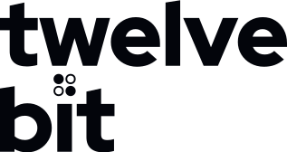
The logo is a wordmark with one change. Four of the twelve bits take the place of the dot on the i. In the site and app headers they switch like live data arrives.
Live in the header. Still everywhere else, and when your system asks for reduced motion.
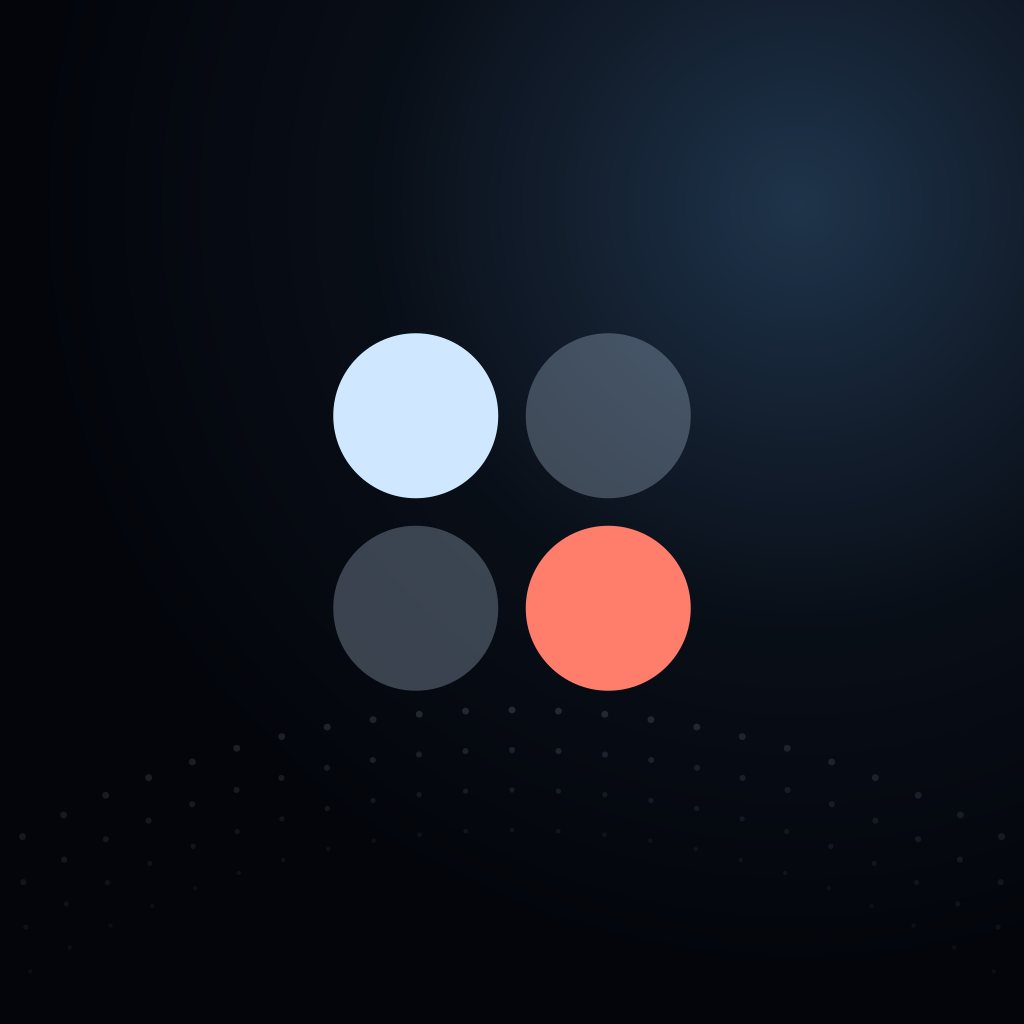
- Bit 1, Ice. A visit. It is always lit in the still logo.
- Bits 2 and 3, unlit. Bits that wait for data. They show at 26% of Ice.
- Bit 4, Coral. A payment. Coral is the colour of money, so it is the only coral in the logo.
Why the dot
The name means twelve bits. The product shows live data with four of them, the Readout. Put the Readout on the i, and every live indicator in the product is also the logo.
How it moves
Each bit switches on and off in steps, at its own slow rate: 1.6 s, 2 s, 2.4 s, 3.2 s. The still frame lights the diagonal: bit 1 and bit 4. Only the tittle moves. The letters never move, and the logo never fades, bounces or glows.
02 · Clear space and size
Give it one x-height of room.
The unit x is the x-height of the wordmark. Keep at least 1x clear on every side of a lockup. Around the symbol alone, keep a quarter of its width clear.
Minimum sizes
 Horizontal 96 px wide or more · 24 mm in print
 Stacked 64 px wide or more · 16 mm in print
 Symbol 24 px or more
 Below 24 px use the 16 and 32 px favicon masters
03 · Lockups
Three shapes, four colourways.
Horizontal is the default. Stacked is for square spaces. The symbol is for places where the name is already on the screen. Each one comes for dark grounds, light grounds, one colour and white.













 Revenue · twelvebit
04 · Do and do not
Use the files as they are.
The wordmark is artwork, not type. Use the SVG, keep its colours, and keep its shape.
05 · Colour
One colour, one meaning.
This is the Deep Field palette that the product ships. A colour means the same thing on every surface. The logo uses only Ink, Ice and Coral. Select a value to copy it. Contrast is measured against Space.
Ground and text
--bgThe page ground. Deep space behind the globe.
Ground--inkPrimary text and the wordmark.
18.2:1 AAA text--mutSecondary text, labels and axis text.
6.6:1 AA text--dimTimestamps and inactive dots.
4.9:1 AA textMeaning
--iceTraffic and visitors. The lit bit. The primary button.
16.1:1 AAA text--coralRevenue and payments. The coral bit in the logo. Money only.
8.1:1 AAA text--mintSignups, goals and positive change.
13.5:1 AAA text--skyLive state, links and the globe glow.
9.6:1 AAA text--amberCode values and warnings. Never in the logo.
12.9:1 AAA text--redErrors only. Errors never use coral.
9.1:1 AAA textPlans (categorical)
--p1Starter. Fixed order, never cycled.
6.1:1 AA text--p2Pro. Also the coral bit on light grounds.
5.6:1 AA text--p3Lifetime.
6.5:1 AA textLight grounds
For docs, print, invoices and partner pages. Each meaning colour has a deeper version that passes 4.5:1 for text. Contrast is measured against Daylight.
--dayThe light ground for docs, print, invoices and partner pages.
Ground--nightText, the wordmark and the lit bit on light grounds.
17.4:1 AAA text--p2The coral bit on light grounds. Graphics only, not text.
3.3:1 Large text and graphics--coral-tCoral words in text on light grounds.
4.5:1 AA text--mint-tGoal words on light grounds.
4.6:1 AA text--sky-tLinks on light grounds.
4.8:1 AA text- Keep coral for money. Do not use coral as a general accent or for errors. Errors use Error, #FF8C8C.
- Put text on glass. Body text over the globe sits on a glass panel: rgba(10,16,30,.74) for cards and .86 for long text.
- Plans keep their order. Plan 1, 2 and 3 always map to the same plans. Never cycle them for other series.
06 · Typography
Red Hat Display for words, Red Hat Mono for data.
Display sets everything people read. Mono sets data, code, timestamps and axis labels. Both are free under the SIL Open Font License.
07 · Meaning colours
The highlight takes the colour of what it counts.
A headline highlights one phrase, in the colour of the thing it measures. The highlight links to the data behind it.
12,840 people visited this month.
amber-fox paid $49 for Pro.
1 in 6 people finish this funnel.
37 people are here now.
08 · The Readout
The only mark that moves.
The Readout is the tittle on its own, in the colour of the event. It shows live state across the product. Feed rows age: four bits switch, then two hold, then one holds.
Kinds
States
09 · Icons
Circles and straight lines, like the bits.
- Icons sit on a 20 px grid with a 1.5 px stroke, round caps and round joins.
- Build icons from circles and straight lines. Corners are 2 px.
- Icons are Ice or Muted. Only bits and the Readout are filled.
- Never put the logo in an icon set. Never animate the letters of the logo.
10 · Imagery
The globe and the data. No photos.
- The globe is 2,600 points on a Fibonacci sphere, tilted 22°. Land is brighter than ocean.
- Pings use the meaning colour of the visitor’s last event. Arcs go from the visitor to the server region.
- The globe sits behind content, never inside a card. It stops for reduced motion.
- Charts use linear scales and one y-axis, with values on hover. Name the time range and the attribution model.
X brought 34% of revenue from 22% of visitors.
11 · Voice and tone
Lead with the number, in a plain sentence.
State a fact; do not give advice. One sentence, about 20 words at most, in the active voice. Write “twelvebit” in lower case, also at the start of a sentence.
12 · Where it appears
One logo on every surface.
Product
The horizontal lockup, 20 px high, top left. In the app header the tittle switches live; everywhere else it is still. The favicon uses the 16 and 32 px masters.
Marketing
One sentence-first headline over the moving globe. The full-colour lockup on Deep Field. A coral ground only for a reversed logo at events.
Docs
Docs may use the light set: Daylight ground, Night text and the deeper meaning colours. Code is set in Red Hat Mono. The lockup uses the light version there.
Social cards
1200 × 630. The lockup top left at 3.6% of the width, one sentence, the globe cropped at the right edge, and the domain in Mono. No dashboard screenshots.
npm and CLI
A text version of the logo: ▘▗ twelvebit. Ice and coral as 256-colour ANSI (153 and 209). The spinner is the Readout drawn with quadrant blocks, ▘ ▝ ▗ ▖, with ▚ as the calm frame.
MCP and agents
Tool names and answers in plain sentences with the number first, so an agent can quote them unchanged.
The wordmark as a PNG (120 × 24 on Space) at the top left, linked from an absolute URL. The alt text is “twelvebit”.
13 · Downloads
Every file, in one zip or one at a time.
The SVG files are the masters. The PNG files are exports at 1x and 2x.
SVG
- twelvebit-horizontal.svg
- twelvebit-horizontal-light.svg
- twelvebit-horizontal-mono.svg
- twelvebit-horizontal-reversed.svg
- twelvebit-stacked.svg
- twelvebit-stacked-light.svg
- twelvebit-stacked-mono.svg
- twelvebit-stacked-reversed.svg
- twelvebit-symbol.svg
- twelvebit-symbol-light.svg
- twelvebit-symbol-mono.svg
- twelvebit-symbol-reversed.svg
- twelvebit-favicon-16.svg
- twelvebit-favicon-32.svg
- twelvebit-app-icon.svg
- twelvebit-app-icon-full-bleed.svg


PNG
- twelvebit-horizontal.png480 × 95@2x960 × 190
- twelvebit-horizontal-light.png480 × 95@2x960 × 190
- twelvebit-stacked.png320 × 169@2x640 × 338
- twelvebit-stacked-light.png320 × 169@2x640 × 338
- twelvebit-symbol.png64 × 64@2x128 × 128
- twelvebit-symbol-light.png64 × 64@2x128 × 128
- twelvebit-app-icon.png512 × 512@2x1024 × 1024